Product
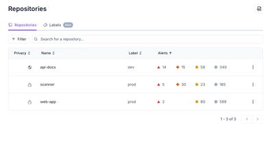
Redesigned Repositories Page: A Faster Way to Prioritize Security Risk
Our redesigned Repositories page adds alert severity, filtering, and tabs for faster triage and clearer insights across all your projects.
bpk-component-input-css
Advanced tools
Backpack input component.
npm install bpk-component-input --save-dev
import React from 'react';
import BpkInput, { INPUT_TYPES, CLEAR_BUTTON_MODES } from 'bpk-component-input';

export default () => (
  <BpkInput
    id="origin"
    type={INPUT_TYPES.text}
    name="origin"
    value="Edinburgh"
    onChange={() => console.log('input changed!')}
    placeholder="Country, city or airport"
    clearButtonMode={CLEAR_BUTTON_MODES.whileEditing}
    clearButtonLabel="Clear"
    onClear={() => console.log('input cleared!')}
  />
);
| Property | PropType | Required | Default Value |
|---|---|---|---|
| id | string | true | - |
| name | string | true | - |
| type | INPUT_TYPES (one of) | false | INPUT_TYPES.text |
| value | string | true | - |
| clearButtonMode | CLEAR_BUTTON_MODES (one of) | false | CLEAR_BUTTON_MODES.never |
| clearButtonLabel | string | if clearable={true} | null |
| dockedFirst | bool | false | false |
| dockedLast | bool | false | false |
| dockedMiddle | bool | false | false |
| inputRef | func | false | null |
| large | bool | false | false |
| onClear | func | if clearable={true} | null |
| valid | bool | false | null |
Additionally, all native <input /> attributes such as placeholder and onChange are supported.
Note: When clearButtonMode is set to always, validity icons will not appear.
The withOpenEvents higher-order component encapsulates input event handlers for opening popovers or modals.
The onOpen callback is called on the following events:
You can still attach custom handlers for these events as they will still be called. All other key events are prevented.
It is important you pass the
isOpenprop, as it is necessary to work around an IE bug.
| Property | PropType | Required | Default Value |
|---|---|---|---|
| isOpen | bool | false | false |
| onOpen | func | false | null |
| hasTouchSupport | bool | false | (feature detection) |
import React from 'react';
import BpkInput, { withOpenEvents } from 'bpk-component-input';
import BpkPopover from 'bpk-component-popover';

const EnhancedInput = withOpenEvents(BpkInput);

export default () => {
  constructor() {
    super();

    this.state = { isOpen: false };
  }

  onOpen = () => {
    this.setState({ isOpen: true });
  }

  onClose = () => {
    this.setState({ isOpen: false });
  }

  render() {
    return (
      <BpkPopover
        id="popover"
        target={
          <EnhancedInput
            id="input"
            value="An input?"
            isOpen={this.state.isOpen}
            onOpen={this.onOpen}
            onChange={() => null}
          />
        }
        onClose={this.onClose}
        isOpen={this.state.isOpen}
        label="Popover"
        closeButtonText="Close"
      >
        A popover!
      </BpkPopover>
    );
  }
}
FAQs
Backpack input component.
The npm package bpk-component-input-css receives a total of 65 weekly downloads. As such, bpk-component-input-css popularity was classified as not popular.
We found that bpk-component-input-css demonstrated a not healthy version release cadence and project activity because the last version was released a year ago. It has 5 open source maintainers collaborating on the project.
Did you know?

Socket for GitHub automatically highlights issues in each pull request and monitors the health of all your open source dependencies. Discover the contents of your packages and block harmful activity before you install or update your dependencies.

Product
Our redesigned Repositories page adds alert severity, filtering, and tabs for faster triage and clearer insights across all your projects.

Security News
Multiple deserialization flaws in PyTorch Lightning could allow remote code execution when loading untrusted model files, affecting versions up to 2.4.0.

Security News
NVD now marks all pre-2018 CVEs as "Deferred," signaling it will no longer enrich older vulnerabilities, further eroding trust in its data.